Basic Accessibility Checklist
Under development. More checks coming.
- Use proper content structure
- Speak clearly
- Label figures and images with alternative text
- Follow a logical reading order
- Ensure good colour contrast
✅ Use proper content structure
Use headings for headings, lists for lists, and tables for tables.
When you use the structure elements tools like Microsoft Word provides, those elements (and their structural meanings) are communicated to assistive technologies.
✅ Speak clearly
- Use plain language.
- When using abbreviations and acronyms, always define them on first use.
- Ensure images have enough quality to not appear blurry or pixelated.
- Ensure information isn’t conveyed by colour alone.
✅ Label figures and images with alternative text
Alternative text is used to describe images and figures to users who may not be able to see or understand the image without assistance.
Learn more about writing good alternative text.
✅ Follow a logical reading order

Tools like Microsoft Powerpoint can create floating text boxes and images. Oftentimes, floating items are inserted outside of the “visual” reading order, at the end of the document. If the document will be consumed on a machine, it is recommended to avoid floating items to maintain a proper reading order.
✅ Ensure good colour contrast
Not everyone has perfect vision. It is important to ensure a good colour contrast exists between foreground and background colours.
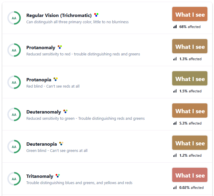
A tool like Who Can Use can help test combinations and simulate what they may look like for users with different types of colour blindness.
💡 Keep in mind text that appears over images or multicolour backgrounds.
Additional Resources
City of Peterborough - Intro to Accessible Documents
A full course that discusses the key concepts of creating accessible documents.
Government of Canada - How to create accessible documents on Office 365
While the focus is on the Microsoft Office suite of applications,
this article contains good advice for documents in general.